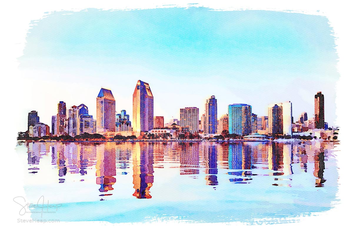
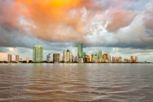
I’ve been playing around with converting some images to become “digital art.” I know that is almost a nonsense phrase – art is what an artist directly creates, and digital art is created by some “mucking about” with software on a computer! However, some of my attempts at digital art do seem to be popular with collectors. This one of San Diego that I created a year or two ago, seems to strike a chord with its warm and pastel shades:

I decided to try to be a bit more scientific about which approaches worked for me and started with a photograph that I haven’t really worked on in the past – one from the downtown campus of West Virginia University in Morgantown with a more unusual view of the historic Woodburn Hall. I’ve written about this famous and iconic building before here on Backyard Image if you are interested in learning more.
Here is the original photograph:
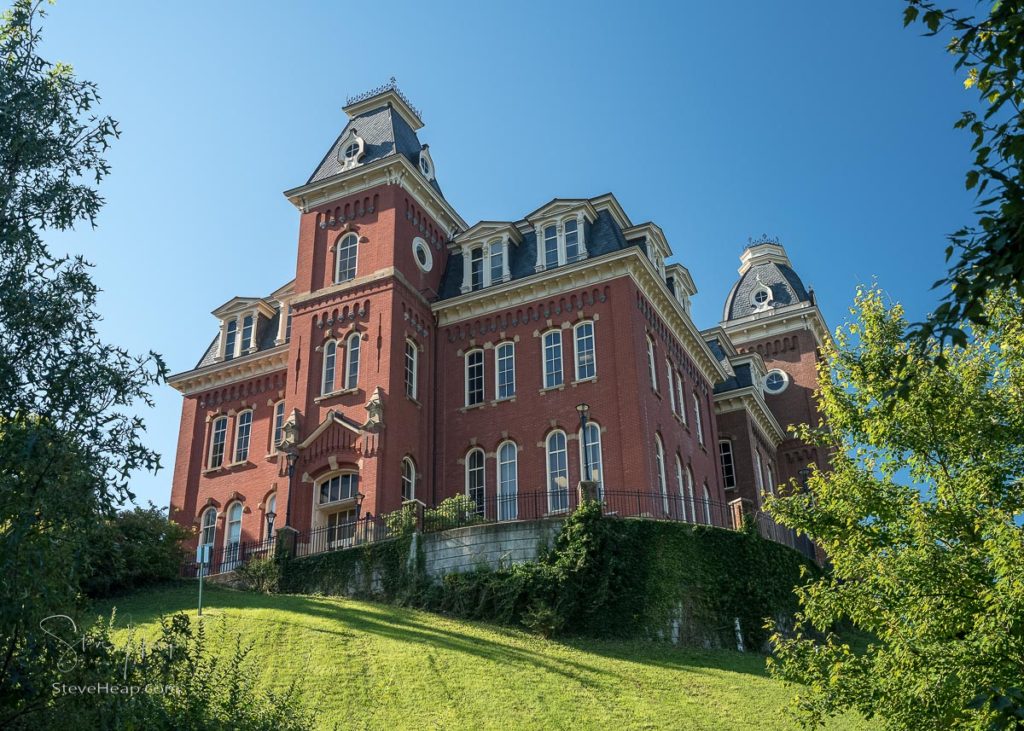
This is from the hillside below and to the side of the building. There are steps down the left to the more modern buildings on Campus.
My first attempt at creating more of an artistic impression is with a colored pencil version created with the help of a plugin called Jixipix Pastello. This has a range of options from charcoal through color pencils to crayons and with each, there are endless variations of technique that create very different end results. If you want to explore these applications more, here is my affiliate link to the company.
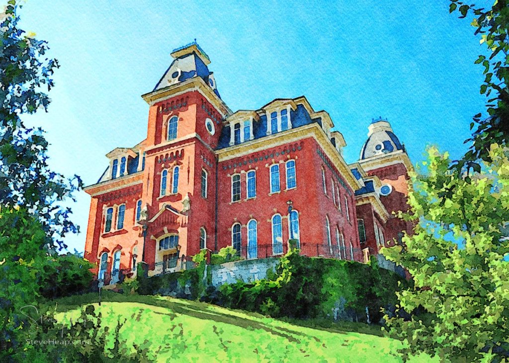
My first attempt had a vivid yellow green lawn that really attracted the eye, but I think this version is more subdued and you can focus more on the building. Next up was another Jixipix plugin called Impresso. This is much more focused on impressionistic versions of the image, many of which have the tache (I think that is the right term) blobs of paint which gives an abstract feel. It might be my photographic background, but I do tend to go for versions that are reasonably close to the original. That may actually be a fault, as a painter can take much more dramatic approaches which give the feeling of the building without all the details that I end up with. That could be my next experiment – how far can I go from reality and still feel comfortable! So here is my attempt at impressionism:
I think you can probably see what I mean – it is different, but not immensely different to the first one. Blame the driver!
Jixipix has a very neat watercolor application that I used on the San Diego image so that was next up for experimentation. This gives a very different look (it’s because the wet paint runs into the adjacent colors!)
My final version from these Jixipix applications is a tinted, almost antique version of the photograph.
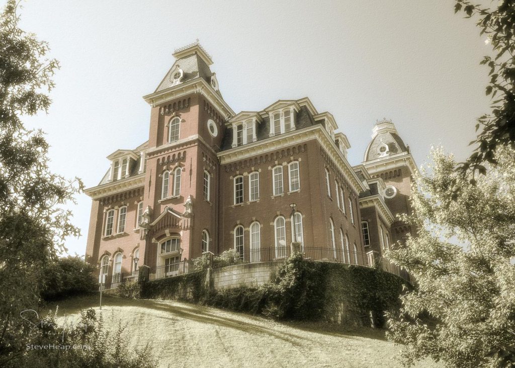
Obviously still a photograph, but I think it has shades of color in there to make it appear more hand tinted that pure sepia.
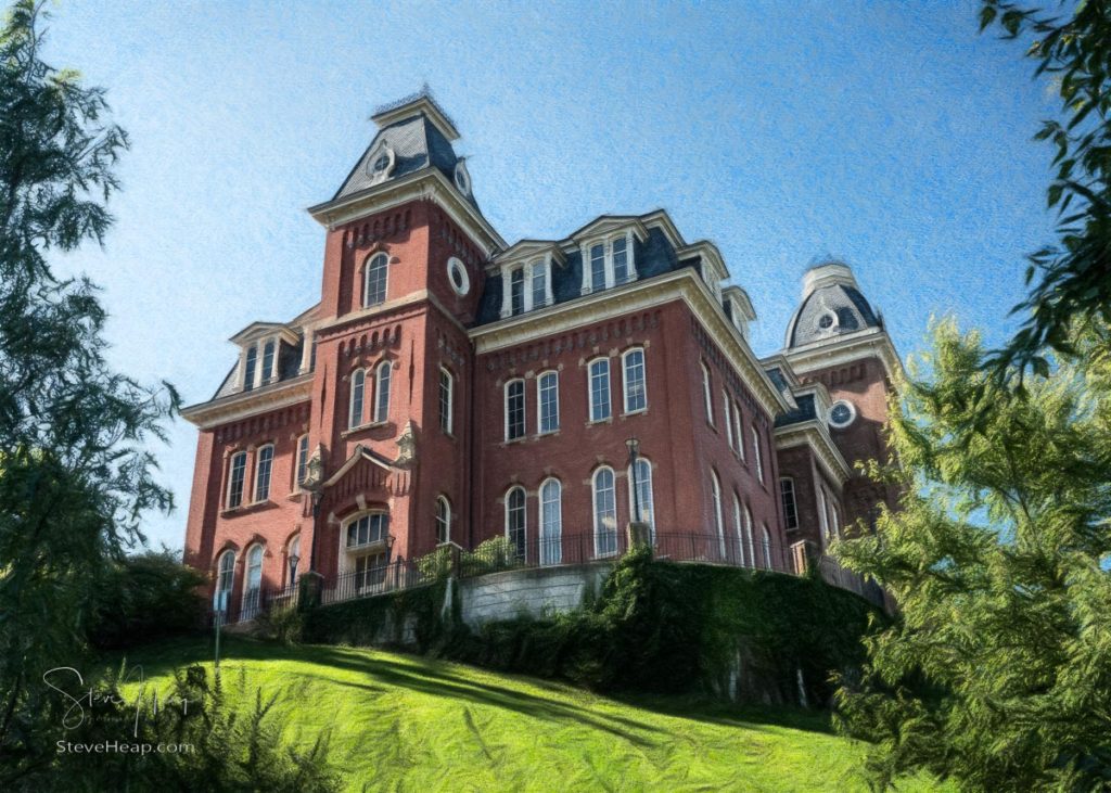
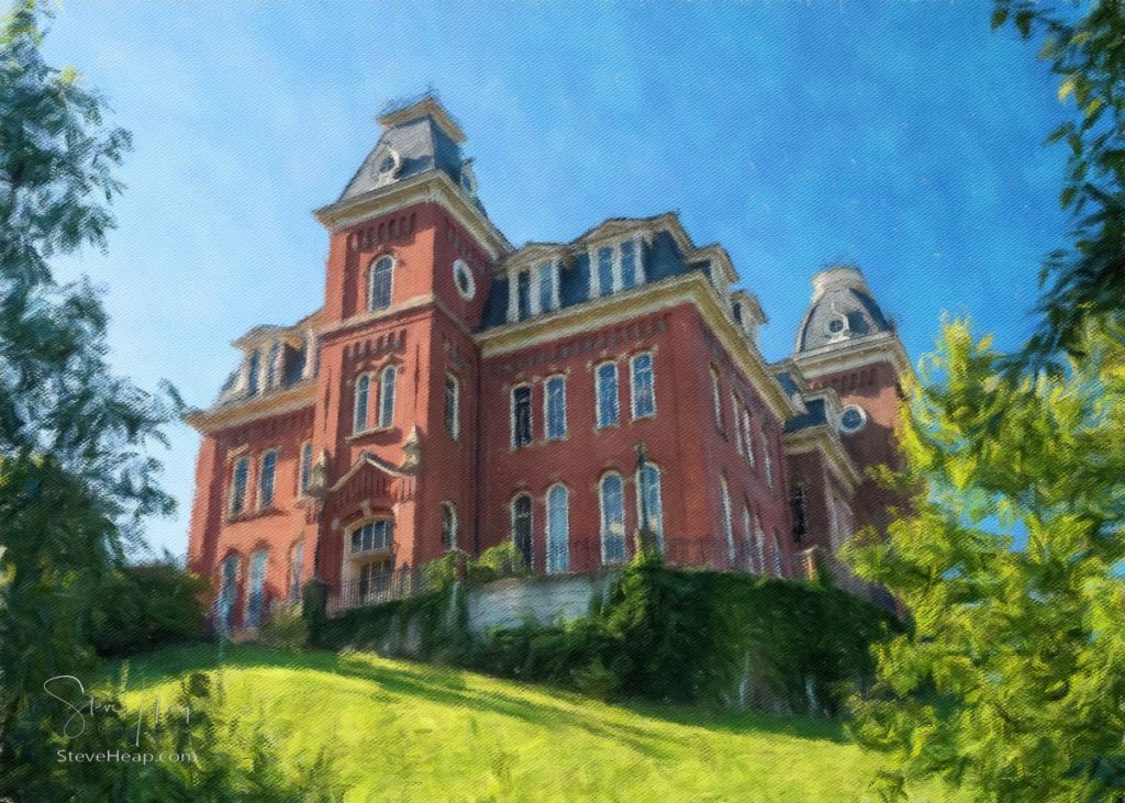
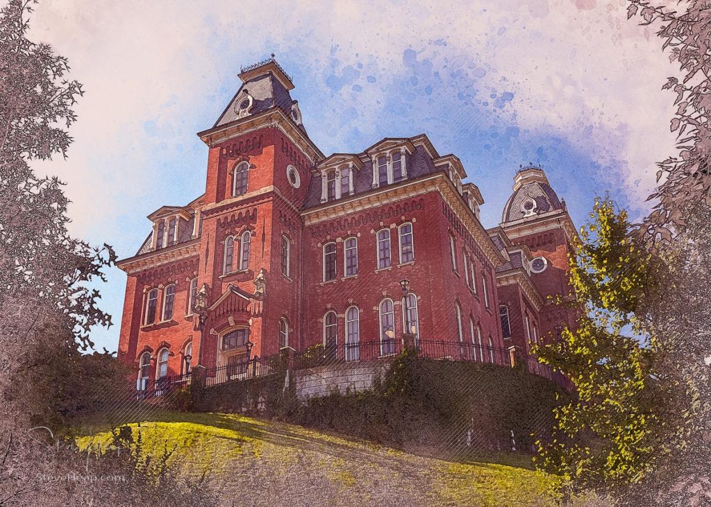
Photoshop has many tricks up its sleeve and there are some applications that run within Photoshop that create highly customizable more technical drawing results. The possibilities here are endless, but I worked on two that I thought were worthy of display. It is hard to really describe what sort of artistic style these are in – I just call them technical impressions:
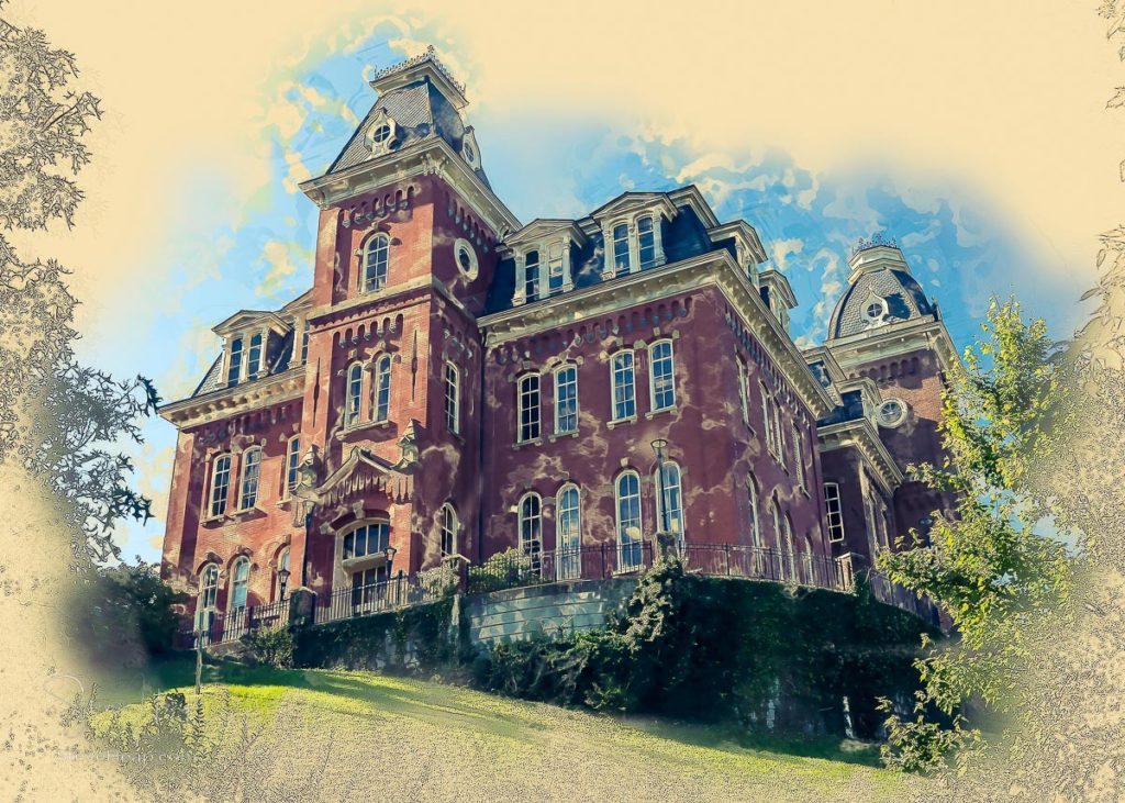
A lot of drama here obviously but it has a certain power, I think! My next one has a different style with the setting sun giving it a much redder and warmer feel and the colors fade out to the line sketching around the edge of the frame:
Well, that is my current set of digital artwork around this building. I do think, in looking at them, that I am allowing my photographic vision to fight against a more artistic approach so that each one appears more like a modified photograph than something that could have been created on paper. That needs to be my homework for my next session. But in the meantime, I would welcome any critiques or comments on which, if any, are “wall-worthy” for a graduation present, perhaps, for a WVU student!
Alessandra Chaves
21 Jul 2022I really think in this type of art it’s important to find a style so you can create a series of images with the same appeal to collectors who like that style. FYI I have used topaz labs with different levels of satisfaction. It’s free and gives you many different presets. I did use a few in my still life work that I try to sell at fineartamerica.
Steve Heap
22 Jul 2022That’s a very good point. No-one wants to sort through many variants of the same image. They just want to see the one or two that I think best creates the image.
Annie
23 Jul 2022What an interesting set of digital conversions, For me the watercolor is the best . I can see why your original of San Diego is popular , it’s lovely
Steve Heap
23 Jul 2022Yes, I think so as well. I seem to have a habit of making the other ones look too much like photos!
Rich Franco
23 Jul 2022Steve, I guess if I have to GUESS, then the watercolor version…..
Rich
Steve Heap
23 Jul 2022Yes, I think that is where my head is at
Louis Dallara Fine Art Photography
24 Jul 2022Hi Steve; I like the antique version the best.
Steve Heap
24 Jul 2022Yes, that did turn out well!
kmgunnart
27 Jul 2022While I agree that the “watercolor” one has the best feel to it, I’d like to mention that real watercolor is a lot more unruly most times! The watercolor filter still makes for a very tight and precise image. One reason handpainted watercolor artwork with that level of paint control and detail is so expensive is because it doesn’t always stay where you put it – though that is also the major reason watercolor painting is both fun and challenging.
Overall, I think which filter looks best depends on what you are trying to convey about an image, which calls back to previous conversations we’ve had about art being a form of visual communication. What about this particular building from this particular angle and this particular lighting are you trying to communicate? Is it the straight lines, the angles of the light, or the play of red bricks and green lawn?
Answer these questions, and you’ll have your answer to the question you posit at the beginning of this post, IMO.
Steve Heap
27 Jul 2022Interesting discussion, as always. However, I think I am deciding on a particular angle and message when I take the photo – in this case an unusual view of a well photographed building, a feeling of power with it looming over you, and interesting light with the sidelit perspective. So the story is sort of set at that time. So why try these filters? I think it is solely to provide some options to a potential buyer when they are thinking about whether it would match their decor. Someone might want a straightforward photo, someone else may have a preference for watercolors as they have others in the same style. So, I think I am offering a choice. I do agree that some subjects would fit better with a stronger heavier paint style. That San Diego one is the opposite – it is quite a light airy sort of view and I wanted to show that in the watercolor version.
Bill Swartwout
3 Aug 2022Steve, you’ve go some interesting stuff here. I am taking note of what you’ve done with the building – because I, too, am exploring with different filters. With Woodburn Hall I like two of them above the others. The watercolor and the sepia (goldtone) are my two favorites. Maye because I like that variation of a couple that I have tried.
I do agree that you need to stick with the effect (or maybe two) effects that YOU think are the best. After all, YOU are the artist.
I also very much like the San Diego city skyline with pastel shades. I need to try that with a couple of the Baltimore skyline shot that I have. It may be a form of photo manipulation but it really is an art form. Keep on keepin’ on – you are creating some positive imagery.
Steve Heap
4 Aug 2022Thanks Bill! I am enjoying this new artistic direction and will certainly try some more. Thanks as well for the very full comment – it was useful to me to hear what others think of my work!